So, ive been keeping a few drafts open hoping to keep updating them as i go along the progress, as soon i knew what i wanted to happen in my final outcome, i decided to track how characters place, colour would change as i had to adapt them to one another.
So lets step in, and go back in time.
 |
This is probably the first point in which i had start to draw this character It was my "im grumpy about my back and im going to draw whatever i feel like" epiphany day and i just fell in love with it. The strong brow, linking with the arches of the nose, give a really blocky feel to the face that i think breaks it up really well, sometimes with minimal figure drawing your left with a lot white space which is fine but i liked that this effect gave some dimension and gave that strong focus to the centre of the face, its almost like I've given a flat line drawing of a face some contours, which is a bonus!
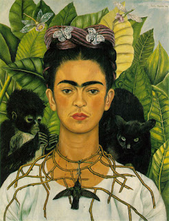
I chose for this to be green, just because i spent the rest of the day painting in black ink and i didnt want to be that depressing all day so changed it up. I think whenever i draw figures of women theres always an element in them that it could be me. I but most of the characters in this whole project with a bun on the top of their head, as when im at home moping about feeling sorry for myself shaove my hair into a bun and place it right on the top of my head so i feel like i have no hair (glorious feeling not to have a hair scarf constantly) Also its a slight nod to the fact that since ive been dealing with back pains, i have some reverence when it comes to Frida Khalo, i didnt want the project to become "oh i think ive got it as bad as her" so i havnt spoken about it much at-all through the project, just some slight hints here and there. As you'll see in the iconic self portrait ive added in she wear her hair up onto of her head also and surrounded herslef with vines around the neck leading down to her spine, i didn't want to completely rip the poor girls idea off, but i liked the idea of adding in elements of her ideas to get across what i was feeling at the time, and so i added an decorative wreath around my figure.
(Frida Kahlo, Self-portrait with Thorn Necklace and Hummingbird, Nikolas Muray Collection, )

My project a few weeks on, had moved into knowing i wanted to have a figure in the woods representing the Japanese godess of death "Izanami-no-Mikoto" after finding out all the things about the sea of black tress, it just seemed fitting to have a japanese mythological character in the woods, and when i find out about Izanami, it just clicked. there was very formatted way to all the depictions of her ad been made, she had on the classical long gown, and a samurai sword and long dark hair with a bun placed on the top. I mean, i could really make this stuff it, it was sheer coincidence that it just work perfectly with the drawings i had been previously making. So when the workshop came where we were asked to make 4 double page spreads i decided to give a go at just drawing the top half, focusing more on her face.I was really happy how my earlier drawings were developing and working for me now,i think even if i hadn't of made the earlier drawings, she would of still ended up being drawn like this by my hand. I knew i had the composition of the face right i just now needed focus on colour.


In the end i went for a happy balance of the two, and i think this worked out the best. i kept the hair fairly dark as in depictions i'd previously seen she had jet black hair but this just wouldn't of looked right in the painting, so i came as close as i could, and i think it actually framed the face well in the end. I kept the blush in the cheeks to give a semi-human feel still but toned down a lot of the shading on the face so you get the ghostly effect.
I think also the sizing of the piece in the final was key. Ive spoken previously about wanting the two figures to be larger then the scenes as i want them to pop ouf more to the viewer and the overly large face compared to the tiny figures seen in the scenes around really give that effect.
Gosh that was a bit text meaty want it! hopefully not to boring!
Update soon!


No comments:
Post a Comment