Friday 10 May 2013

The Final Product.


Hello there!
in what seems like forever, to make it sound evermore dramatic.
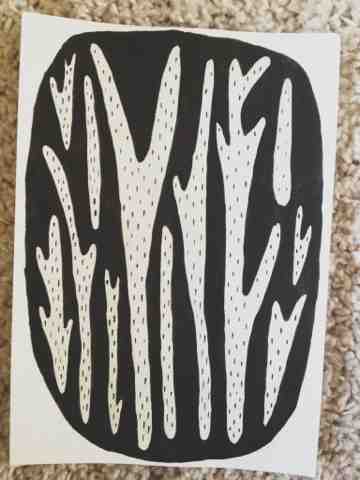
It is made.
Yes, thats right the final painting/s has been finished and, let me just say that thing took me way over the time i expected (i seem to always do this). After the first day painting all the main washes of colour, i kept a timer going and stopped it every time i took a break to do other things while it dired, the whole thing (barr the first day) took over eight hours! (broken up into two and half days)
I dont think ive ever made something that took me more then 40 minutes since.... my GCSE's.
But on a serious note, it felt so good when i had finally finished, i think especially when you spend long amounts of time looking at one piece, you kinda start to hate it.
And yes, as I've said in my project summery (which i will add onto the blog after ive handed in for final assessment  i dont think its the most beautiful painting I've ever done. Theres a fiar few blobs of stray dirty water places on it and some annoying smudges but my god, i feel like i went through something with that god damn thing so i just dont care anymore.
I tried as much as i could to keep remembering to take photographs of the final throughout the time painting it, but i just seemed to forget a lot and the lightings bad as i went into the early hours of the morning.
I found that also, out of stupidity, i assumed that buying the most expensive paper would give me the best results, it probably would for someone doing gorgeous, sheer layers of watercolours, but as i was basically using my watercolours as if they were poster paint, it took SO many layers to build up the paint thick enough so that it was opaque.
If i was to go back in time, i probably would of looked into gouaches and acrylics but i just got so swept up in the story development that i never even thought to explore new medias.
So i write this now on the day before hand-in so this could potentially be one of my last posts, i have A LOT of backlogged drafts to go up though, so im not to sure if blogger will mess up the timeline of everything.
Oh and i'll also be doing a write-up of what happened after i've received my feedback and grade so even though the blog might be quite for a week or so, it will come back at some point with a roundup and then the next project!
Update Soon!


P.S technical note, something is going wrong with the picture quality on the posts this week, i have no idea whats going on, i did a blogger update on my iPad and now, all the photos are coming up horribly grainy, this best not stay otherwise its going to screw up the whole way i can work without using wires or paper. (Ive managed this whole project to solely rely on my iPhone to take the photos, my iPad to write up 80% of the blog posts and my Macbook to do my research, so hitting this now is terribly frustrating as i thought i was going to take over the world with good, digital, reflective journals.) 

Wednesday 8 May 2013

Symbolism in the forest development.


Floating figure in the forest character development.


Traveler in forest development.

At the first point of deciding that i wanted to show the emotion journey through a physical one as well  i had ideas of someone walking through a wooded area, at the time in pain. This was the first sketch i made showing someone walking through, i knew i wanted a figure, but at this point i was still looking at it quite literally, this one was myself, thinking about myself (how vain of you rachel) but using my previous ink paintings and developing the idea into something a lot more visually descriptive.  

I spent time looking at the different way of showing this and it was this time that i found out about "the black sea of tree's" and then started getting a lot more into looking at the actual drwing of the forest as a thing.   


Character development - figure in the woods.

(Aloha there, so as i said in the last post, i have a massive backlog of posts i need to upload so theres going to be a hell of alot being post in a short space of time, i apologise if this gunk's up your feed boxes but its my party and i'll spam if i want to.)


So, ive been keeping a few drafts open hoping to keep updating them as i go along the progress, as soon i knew what i wanted to happen in my final outcome, i decided to track how characters  place, colour would change as i had to adapt them to one another.
So lets step in, and go back in time.


This is probably the first point in which i had start to draw this character  It was my "im grumpy about my back and im going to draw whatever i feel like" epiphany day and i just fell in love with it. The strong brow, linking with the arches of the nose, give a really blocky feel to the face that i think breaks it up really well, sometimes with minimal figure drawing your left with a lot white space which is fine but i liked that this effect gave some dimension and gave that strong focus to the centre of the face, its almost like I've given a flat line drawing of a face some contours, which is a bonus!
I chose for this to be green, just because i spent the rest of the day painting in black ink and i didnt want to be that depressing all day so changed it up. I think whenever i draw figures of women theres always an element in them that it could be me. I but most of the characters in this whole project with a bun on the top of their head, as when im at home moping about feeling sorry for myself shaove my hair into a bun and place it right on the top of my head so i feel like i have no hair (glorious feeling not to have a hair scarf constantly) Also its a slight nod to the fact that since ive been dealing with back pains, i have some reverence when it comes to Frida Khalo, i didnt want the project to become "oh i think ive got it as bad as her" so i havnt spoken about it much at-all through the project, just some slight hints here and there. As you'll see in the iconic self portrait ive added in she wear her hair up onto of her head also and surrounded herslef with vines around the neck leading down to her spine, i didn't want to completely rip the poor girls idea off, but i liked the idea of adding in elements of her ideas to get across what i was feeling at the time, and so i added an decorative wreath around my figure.
(Frida Kahlo, Self-portrait with Thorn Necklace and Hummingbird, Nikolas Muray Collection, )


My project a few weeks on, had moved into knowing i wanted to have a figure in the woods representing the Japanese godess of death "Izanami-no-Mikoto" after finding out all the things about the sea of black tress, it just seemed fitting to have a japanese mythological character in the woods, and when i find out about Izanami, it just clicked. there was  very formatted way to all the depictions of her ad been made, she had on the classical long gown, and a samurai sword and long dark hair with a bun placed on the top. I mean, i could really make this stuff it, it was sheer coincidence that it just work perfectly with the drawings i had been previously making. So when the workshop came where we were asked to make 4 double page spreads i decided to give a go at just drawing the top half, focusing more on her face.I was really happy how my earlier drawings were developing and working for me now,i think even if i hadn't of made the earlier drawings, she would of still ended up being drawn like this by my hand. I knew i had the composition of the face right i just now needed focus on colour.


There were a fair few colour studies done of the face, i looked at more what i would call normal colours, giving her blush in her cheeks and some colour in her face and i liked the actually look of this piece but it just didn't tie in enough with my other paintings. So i then reverted into making her more creature like and giving her dark mossy green skin and brown hair, this tied in more with the paintings but i thought started to make her look to over the top. I wanted her to look like she had just been wandering round the woods aimlessly for centuries, so still in some way human.


In the end i went for a happy balance of the two, and i think this worked out the best. i kept the hair fairly dark as in depictions i'd previously seen she had jet black hair but this just wouldn't of looked right in the painting, so i came as close as i could, and i think it actually framed the face well in the end. I kept the blush in the cheeks to give a semi-human feel still but toned down a lot of the shading on the face so you get the ghostly effect.
I think also the sizing of the piece in the final was key. Ive spoken previously about wanting the two figures to be larger then the scenes as i want them to pop ouf more to the viewer and the overly large face compared to the tiny figures seen in the scenes around really give that effect.

Gosh that was a bit text meaty want it! hopefully not to boring!
Update soon!

Saturday 4 May 2013

03.05.13 - final outcome placement planning.

Have done a few sketches today of what I think I'm going to end up having as the placements of the watercolour scenes.
It actually took more thought then I had originally expected (as usual peel!) Since my scenes take place in a forest, I do just naturally have a repeating pattern of lots of trees, when I was coming up with the idea of having them in a sequence of different shapes and sizes, I didn't take into account the weight of some of the paintings compared to others.
Some of them are heavy in details and colour and then others are a lot of clean and simple so when placing the, onto the page, I want the right balance that's still pleasing to look at.
Taking this in mind, I've added/edited some scenes and I actually think its made the whole thing look a lot more like a flowing story.
I'm hoping you can see this through the quick sketches.
Now is just to paint the mocks and finals all in 5 days :|
Update soon..... if I haven't run away.


02.05.13 - Review day.


30.04.13 - Painting development

So ive noticed that its taking me longer then I expected to paint some of my practice scenes, with this in mind I thought I would take photos of the development of the painting every 30 minutes or so.
It feels like with the effect I desire, I end up painting about 5 layers on the one sheet, so I kindly end 5 times longer then I should. This is a thing I'm relying really hard to work on ANSI thought I would lift you guys up to the fact that just cause you pick a media that feels natural to you, doesn't mean you're not spending to much time on it.
I'll keep you guys updated on if I've learnt any new tricks.