Thursday 27 February 2014

27.02.14 - Collaboration with UEA Creative Writing Partners.


Here are the final images produced for my collaboration project with the lovely people over on the creative writing course at UEA.

My partner was Ella Smith and she kindly sent me over a few of her poems to read through and decide on.
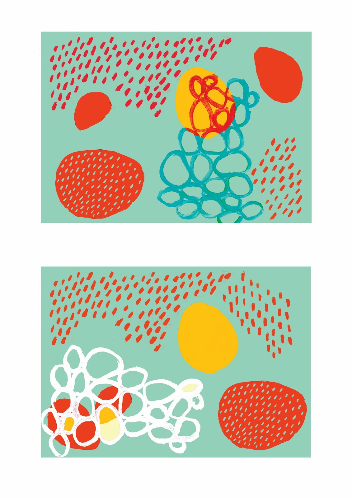
After reading through, i chose this poem as i thought it had such beautiful pace and emotion.
Since Ella's use of word repetition, i wanted to show that someway through the patterns.
I also loved the concept of there being hundreds of small elements that clog up your brain and make you not be able to think clearly.
I therefore used bold, deep, dark, rich colours to show these themes and work with a powerful and bold typeface to get that emotion across.
It was a really enjoyable experience and i wish to continue to work on collaborations!

Update Soon.


Monday 24 February 2014

24.02.14 - Stripping Back (D&AD New Blood Awards - The Body Shop.)


Hello Again
When working on my cropping i have to admit i got a little distracted and started playing about with some older images
I found that when i selected full block of colour, it left me with a strange outline of where the colour had previously been
When left on there own, they made what i personally think really beautiful, delicate line drawings, with a similar look to mono prints.

I thought while i was enjoying working with them, i would add text just to get a general impression of them.
I really like the outcomes, and even though i probably won't take them forward, can see them being used in another aspect of work, maybe for a non-fiction science publication or something of a similar genre.
Update Soon.

24.02.14 - Devlopement with Cropping (D&AD New Blood Awards - The Body Shop.)


Hello Again
As previously explained in my last post, after speaking with my crit group we spoke about cropping some of the posters to show more compositions
Here is the first batch!
Im definitely leaning more towards the 4th and 8th image, i think when i print them out it will be a lot clearer to access them.
Update Soon.

24.02.14 - Monday Crit (D&AD New Blood Awards - The Body Shop.)

Hello Again
So this morning we had our weekly group crit after the break of independent study week.
I went into the crit hoping to find some general opinions on which of the posters was working the best.
Overall the feedback was encouraging.
We spoke about now being at a stage with the image making that i should keep with what i have already made and work with the images further.
One suggestion that was made is that i might find it helpful is to try cropping some of the already made images to let the organic spaces in-between the objects leave room for a place to put the text.
"Consider how the smaller compositions can then be transformed to a larger scale.

So, my plan for the next day or so is to go through all my old images already made and try a few different cropping steles for each poster, print them out and re access them.
Update Soon.

Saturday 22 February 2014

22.02.14 - Weekly Fresh Starts (D&AD New Blood Awards - The Body Shop.)

Hello again,
So i think you can tell, this project has been harder to keep tabs on then the previous one.
Since a lot more is in my control i've been feeling less like documenting the process then on previous projects
But, that does intend to change, i do want to keep this blog as a way for myself to document what has been done and i think a lack of updating on the blog has been due to finding it hard to start from coming back from christmas.
Yes, i know that was over 2 months ago, but believe me it was the quickest two months of my life.
So lets starts with how we intend to move on.
Short, sweet and to the point but i don't see anytime in making excuses.
Update Soon.

Friday 21 February 2014

21.02.14 - More Poster Developments (D&AD New Blood Awards - The Body Shop.)


Hello Again
So at this point I'm still working with the issues I'm coming across with type.
After speaking to Peter and Glyn, I'm going to continue both paths of hand drawn and digital type and then when the actual images are at a level that I'm happy with, and will then work with type later.
I think since i saw the type as a big issue that i wanted to tackle the problem straight away and get it out of the way, but i don't think its something i can solve until the images are at a good enough level.
Update Soon.

Thursday 20 February 2014

20.02.14 - Poster Development (D&AD New Blood Awards - The Body Shop.)


Hello again

So here are some of the ideas I've been going through for the poster designs
Im torn between putting every single thing I've made into one image and then the complete opposite and wanting to be really clean and simple and have a limit of three elements and colours on the screen.

I also don't think that the use of a block section at the bottom of the image where i was thinking of placing the font has worked either, it looks far to corporate.
Oh well always moving on and upwards
Update soon.

Wednesday 19 February 2014

19.02.14 - Festival Pattern Group 1951 - "From Atoms to Patterns" (D&AD New Blood Awards - The Body Shop.)


Hello Again

After speaking with Peter briefly when asking for some general opinions on the developing work, we spoke about the fact that i should look at the Festival Pattern Group in 1951
They used diagrams of atomic structures as inspiration for wallopers, ceramics soft furnishings and many more things

Above is a collection of some of my favourite images I've found online of the collection made that year.
This last image shows the book "From Atoms to Pattern" (and can we just take a minute to appreciate how magnificent the title of this book is, what a brainwave) by Lesley Jackson.
At the moment, the book is on loan at our university library but as soon as it becomes available i'll be straight on that.
Update Soon.

Tuesday 18 February 2014

18.02.14 - Crit With a Difference (D&AD New Blood Awards - The Body Shop.)


Hello Again
So since I've been having so many problems with font, i decided to take some initiative and speak to people who i know would know more about graphic design and fonts then myself.
I decided to contact a old school friend studying Graphic Design in Sheffield to get some insight and his opinions into what could help me develop the use of image and text together.
Ive included a small section of our conversation above.
The general points i took away from the discussion was to worry less about the font in the sense of the way they look and concentrate on the wording to explain what I'm trying to get across in the image.
He advised to bring in the science elements back into the images, making it a little clearer of the idea that i have in mind.

I sent over one surface design i had worked with and Charles edited the image (shown above) to show the dots connected like they would be if seen in a atomic drawing

Overall, the whole thing was a real insight and great help
It definitely calmed me down as to my worrying and gave me some great ideas to continue with.

Update Soon.

Wednesday 5 February 2014

05.02.14 - Artist Study: Sarah Thorne

Ive been thinking a lot more recently about how my pattern will apply to objects and packaging. Its something i could continue into look at with the brief as their is a section to develop a visual merchandise idea.
Sarah Thorne came into sight when i decided to research into the designs of comical beauty products that i think are working well.

"Graphic Designer specialising in print and packaging. Work has included: design of cosmetic ranges, fragrance bottles and boxes, fanzines, magazines, flyers, posters, websites, store graphics and windows. Looking to combine interesting formats, print processes and materials."

Her minimal approach is something i would love to achieve in my work, but i seem to want to always add more!
Update Soon.


05.02.14 - Artist Study: Marimekko

Hello again
After going through my visual research i noticed that Marimekko prints were coming up again and again so i thought i would put a quick artist study on the blog
Marimekko is a Finnish company based in Helsinki that has made important contributions to fashion, especially in the 1960s.
His prints show bold block shapes and colours and have the most most complimentary of colours palettes
very inspiring!
Update soon


05.02.14 - More Poster Designs (D&AD New Blood Awards - The Body Shop.)


Hello Again
Here are some development pieces working with a font i found online

I hate them…

Update Soon

Tuesday 4 February 2014

04.02.14 - Experiments (D&AD New Blood Awards - The Body Shop.)


Hello
Thought i would play around with landscape rathe then portrait for a change.
I think they look like they have some strange narrative to them landscape!
Like they're children's stories.
Im finding that at the moment theres a really thin line in-between including the work in my flora side project or the body shop brief.
I jus kinds get a bit carried away from my starting point and
Hm. Maybe not.
Anyway
Update Soon!

(That empty space is supposed to be white, you can see everything getting a sludgy grey brown hue on it at the moment, rather annoying)

04.02.14 - Fragrance Development (D&AD New Blood Awards - The Body Shop.)


Hello!
Here are some pattern development on the fragrant notes that appear in the white musk perfume.
Its come out with a horrible grey tone on it when turning into jpeg, but i thought i would put it up just to update on.
Update Soon!