Tuesday 3 December 2013

3.12.13 - Work for "The Critique"


Hello Again.
So uni is on directed study for a few weeks so ive been taking the time to finally inform you on something i've been working on for a few weeks.
I've been in contact with an old friend from my college days.
We've decided to collaborate on his online article website.
http://richardaheasman.wix.com/thecritique

The next issue will be around the theme private military and drone warfare.
These are some of the working images we have been discussing back and forth.
Its something completely different for myself and i'll be honest, not taken to much of an insight into heavy war politics but i gotta love a challenge.
Anyway i'll keep you posted on what's going on.
Update Soon!

Thursday 28 November 2013

28.11.13 Final Outcomes.


Hello Again!
So, these are the final, finished outcomes!
God, it feels good to write that.
Thats not to say i haven't enjoyed the project, quite the opposite infact, i think this was the most energetic and productive project i've done in the whole time i've been at uni but with that enjoyment comes satisfaction that its finished.
I decided to go with the text and image layouts as my final as i think its a outcome that shows the most resolution in my work.
The whole project seemed to be about development and resolving problems you've encountered throughout the project, and i think that these demonstrate that well.
I had so many problems throughout the project with layout planning and text placing and font choices that my resolution to all these problems was resolved in these final images.
Im really pleased with how the finals came out, i think the placement of text on each one gives the spot illustration room to breathe and still equals out the page.
The font choice came so late in the project that its a shame i didn't get to put more information about where it came from and show development of choice, but i still don't think that takes away from the fact that it was the perfect choice for the images.
I think after i've had my work back i'll take photos of my portfolio also as i'm really pleased with the whole presentation of all my work.
I spent more time than normal putting together all my work and i think it has shown.
So, yes!
Thats BA7 done and dusted!
It won't go too quiet on the blog, fear not.
I will still be doing work for the stew gallery print sale and also exciting news hopefully to come about an editorial opportunity that's come about!
Update Soon! (but not as soon ;] )


28.11.13 - Artist Research

Hello There

Just thought i would pop in another link to the Pinterest page where I've been keeping all my artist research.
Im a bit unsure if its going to get lost in the sea of post but oh well one more wouldn't hurt!

http://www.pinterest.com/hazydayss/ba7/
ARTSIT RESEARCH PAGE

Update Soon!

Tuesday 26 November 2013

26.11.13 Font Development


Hello again!
I'm so rushed for time at the moment so i apologize if these updates seem short but i've been spending some of my time looking into fonts for possible layouts for final outcomes.
My mind was pretty much made up as soon as i started looking that i wanted to find one similiar to my hand writing but more eligible and neater, which is the first one from the line up.
I did also enjoy number 6 as this is quite similar also, but i just cant get my head around the weird "a" in "tales" so that was a no go.
Anyway i have to go
Update soon!


26.11.13 Further Layout Development


Hello Again
Quick update,
Noticed after speaking to glen that i was putting the text to close to the edges of the pages, I've brought them in and started to give the images a bit more room to breathe
Still yucky font though isn't it, i need to get a new one...
Update more soon!

26.11.13 Continued Layout Development


Hello Again.
So this morning i quickly adapted some of the spot images i had been working on yesterday and added some layout text on top.
I still think this isn't working well, I'm trying to resolve problems I've encountered throughout the project but this is just one hurdle i can't seem to get over and can't help but waste time making more bad development images!
Annoying.
Update Soon.


Monday 25 November 2013

25.11.13 Spot Illustrations Colour and Composition Development.


Hello again.
So I've been still working on the more abstract and block colour interpretations of some spot illustrations.
Im really happy with how these outcomes are coming along.
I had a one to one crit with Chris today about how the project is getting to those final stages and what could/needs to be looked into before we hand-in on friday.
Overall the feedback was good, he was happy with how the illustrations were developing into being more graphic and abstract and that i should continue down that route.
We also spoke about how it might be nice to refine some of the outcomes to maybe 3 or 4 colours to really get a cohesive feel to each piece.
I suggested that it might be good for me to go back on what i had decided as my finals and re evaluate them with the more pattern and block colour way of approaching the work, Chris agreed that this would be a good idea if i wanted to, and that to only do this if i had time.
I'm really pleased with how things are going with this project, i'm glad that i have planned out my weeks well so that i'm not rushed or disorganised coming to the ending of the term.
Up above are a range of the ideas that i looked at today.
I think these specific ones still need to be tweaked but hopefully tomorrow i will have something more refined to share.
Update Soon!

Saturday 23 November 2013

23.11.13 - Spot Illustrations Development


Hello again!
So things are starting to heat up with the end of the project, its Saturday now and as you can tell from the dwindling blog posts, theres been less time spent on development and more organisations and essay work, but the essay has been handed in, and i have figured out the horrible printing problems so now, i have a little bit more time to do some final image development.
I spoke with glyn about doing some collage, spot illustrations ideas with what i already had.
Im liking them a lot at the moment, i was getting a bit sick of looking at all the finals and to be honest with you starting to hate them because i had to look at them so much, so its nice to be playing with a bit of bold block colour.
Update Soon!

Friday 22 November 2013

22.11.13 - Spot Illustrations Image Development


Hello again!
Very quick little explanation, i'll go into it a bit more tomorrow but heres some spot illustrations with some more colour development.
Update Soon!

Thursday 21 November 2013

21.11.13 - The Folio Society


 The folio society are a publishing house who take pride and great detailed into making beautifully published and illustrated books.
When looking for examples of illustrated poetry books, i came across their website.
They have a small but wide range of illustrated poetry books, all hard bound and with their own style.
I'll have to be honest, this did make me a little bit sad when i found it.
No its not technically what I'm going for, but its still within the same region and was slightly disappointed that i hadn't found a hole in the market that hasn't been fulfilled yet.
I think this would be the sort of audience i would be aiming for, people who have a love of classic literature yet also take the time to appreciate a beautiful object and want to add uniquely illustrated editions to their personal collections.

21.11.13 - Poetry Books on the Market


In a effort to research more into what my target audience might be looking into, i decided to take a look into the best selling poetry book list for 2013.

Love and misadventure - Lang Leav

This was 7th in the amazon list, losing first place to a range of… eerrmm dog poetry, which i didn't really even feel like including.

I will be honest, this is not my taste, in poetry or in illustrations.
I find the illustrations manga like and dated and not in a good way and the poetry a bit dull.

If this is an example of whats on the market, I'm glad its my competition.


Where the Sidewalk Ends: Poems and Drawings

shel silverstein

This piece, by Shel Silverstien, i understand a lot more. Even though whenever i see a black and white illustration i immediately want to colour it in, this has thought to it.
I can see humour and composite have been taken into account along with the story line of the poem its been integrated with.
Its still quite far away from what i would have as my target audience though.


The Odyssey

Homer

This, would be as close as i could get to what my target audience would be reading.
And sadly, these books have absolutely no illustrations, they are 100% completely text based. 
I think this actually works out great for me as I'm looking into something extremely visual without any real visuals. I genuinely feel like i could fill a gap on the market.

Syliva Plath
Ariel
Sylvia Plath is a well know and widely collection poet who's work I've seen get a lot of press reguraly and is constantly in print with different versions being made all the time.
This particular version of a short story i found was extremely different to all the others and stood out to me with its hand made feeling.


These illustrated poems i found on the faber website. Faber is the publishing house who published "tales from ovid" the book i have been looking into in this whole project.
These are the first development i have found where the artwork is getting as much respect as the text.
Beautiful colours, still very graphic feeling though, not yet to find a drawing, visual balance.


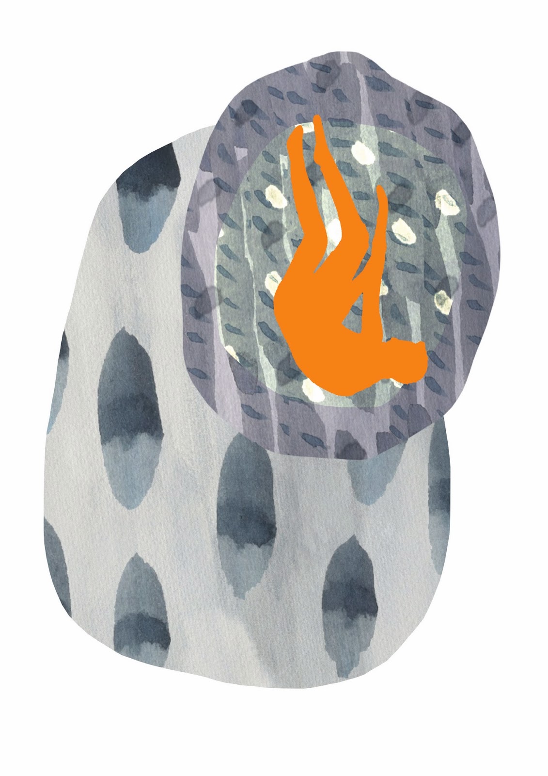
This book cover was also found on the Faber and Faber website.
I thought it would be productive to look into other book covers the writer of tales of Ovid has had.
There seems to be an overwhelming theme of prints going on today….

Update Soon.